Hello there! You've reached the portfolio-ish site of Ben Leduc-Mills. This website captures some of my career from user research and service design, to interaction design, software engineering, rapid prototyping & digital fabrication, open source hardware, and of course, AI.
Creating and Running a Usability Benchmarking Program

While relatively new at GitLab, I was tasked with creating and piloting a usability benchmarking program to be used to systematically evaluate the current state of the product. This ended up being a KPI for the UX org, an addition to the GitLab Handbook, and established Benchmarking as an methodology used by many other researchers across the company to evaluate their areas of the product.
Context & Contributions
GitLab was tracking a System Usability Scale (SUS) score, and it was useful, but only at the level of the whole product. We needed a way to see usability at the level of an individual task, in a way that could be measured the same way twice and actually tell you if things had improved.
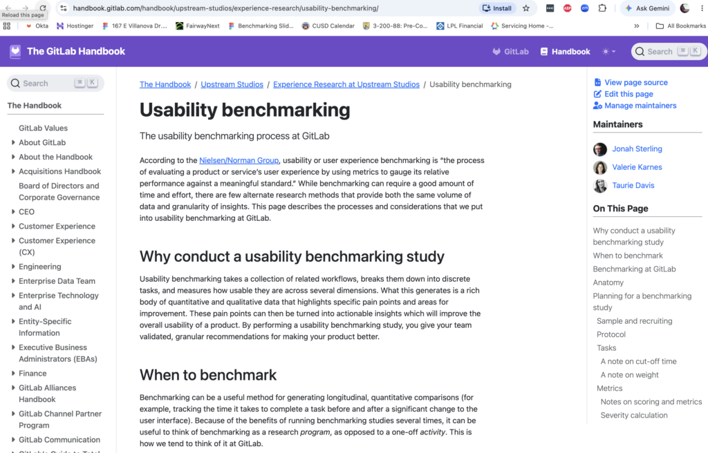
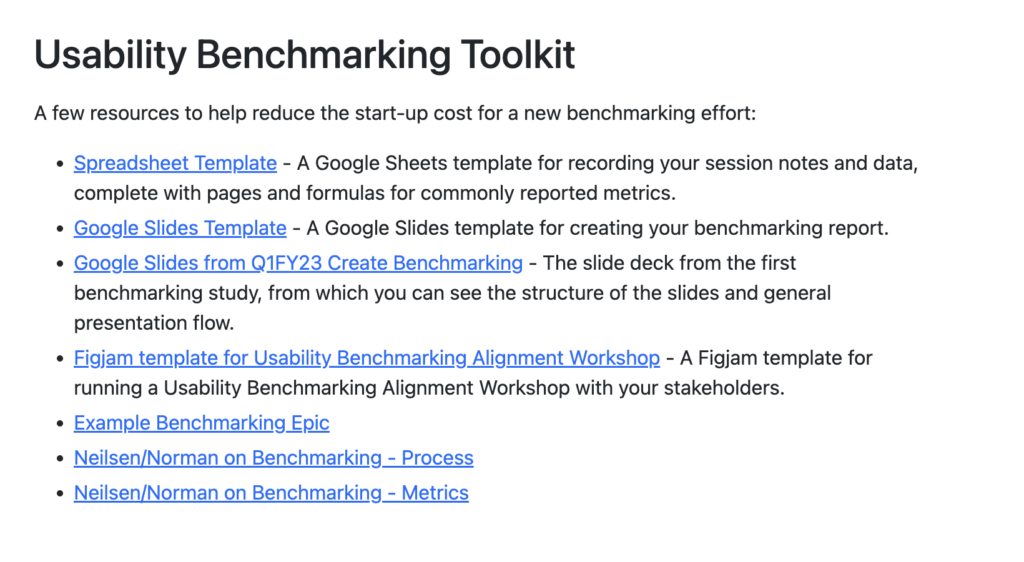
So I built a benchmarking program from scratch: the methodology, the metrics, the scoring rubric, a handbook page documenting all of it, and a toolkit (spreadsheet template, slide template, a FigJam template for running an alignment workshop with stakeholders) so future studies wouldn’t have to start from zero. Then I ran it twice myself for the Create stage, first in Feb 2022 and again in Dec 2023–Jan 2024, specifically so we’d have a real before-and-after instead of two unrelated snapshots. The program outlived my two studies: other researchers picked it up for Plan, Release, Secure, and Verify.
PROJECT DETAILS

ROLE: PROGRAM CREATOR, METHODOLOGY LEAD, AND SOLE RESEARCHER
PROJECT TYPE: RECURRING RESEARCH PROGRAM
DURATION: FIRST STUDY FEB 2022, SECOND STUDY DEC 2023–JAN 2024 (18 MONTHS APART)
Problem
Our SUS score told us GitLab was, in the abstract, fine. It didn’t tell us why a customer might struggle to protect a branch, or where a specific workflow was losing people. Product and design needed something more granular to actually act on, and they needed it to be comparable over time, so that “we fixed it” could be backed by a number instead of a feeling.
Hypothesis
If we broke usability down by task instead of by product, and measured it with the same handful of rigorous metrics every time, we’d get two things at once: specific, actionable insight into where things were actually breaking down, and a real benchmark we could return to and see whether our fixes had worked.
Methods & Process
Understanding
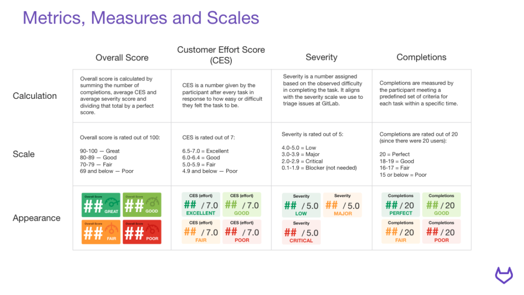
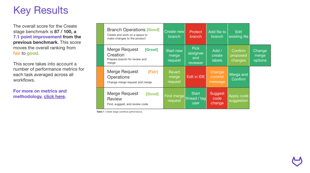
I picked four metrics that, together, cover both what happened and how it felt: Completion Rate (did they finish the task), Time on Task, Severity (how bad the friction was, scored the same way we triage issues at GitLab internally), and Customer Effort Score (how hard it felt, self-reported right after the task). Each one rolls up into an overall 0–100 score per task and per workflow, banded into Poor/Fair/Good/Great, so a score is legible at a glance without losing the detail underneath it if you want to dig in.
Running the studies
The first study, Feb 2022, sat 20 GitLab users down for about two hours each, 20 tasks across four workflows (Branch Operations, Merge Request Creation, Merge Request Operations, Merge Request Review), all built around Sasha, our Create-stage developer persona. The second study, done 18 months later, trimmed to 17 tasks and about 90 minutes per participant, same four workflows, same 20-user sample size, so the comparison would actually hold up.
Delivering
Each report breaks down to the same shape: an overall score, a performance snapshot showing the four metrics and how they moved since last time, workflow-by-workflow and task-by-task scorecards, then a set of cross-cutting themes backed by verbatim quotes from participants, and finally a specific, actionable recommendation tied to a real GitLab issue for anything worth fixing. Nothing in the report is a recommendation without a source quote behind it.
Findings & Results
The first benchmark landed at 79.9 out of 100, right on the fair/good line. Branch Operations and Merge Request Operations both came back Fair, Merge Request Creation was Good, and Merge Request Review was Poor. Three themes ran through it: controls living somewhere other than where people expected them (“I was really looking for like a settings wheel on the right next to the branch… that’s really where I was expecting the settings for that specific branch to be”), information getting hidden or deprioritized when it should’ve been in plain sight, and people finishing an action with no confidence it had actually taken effect.
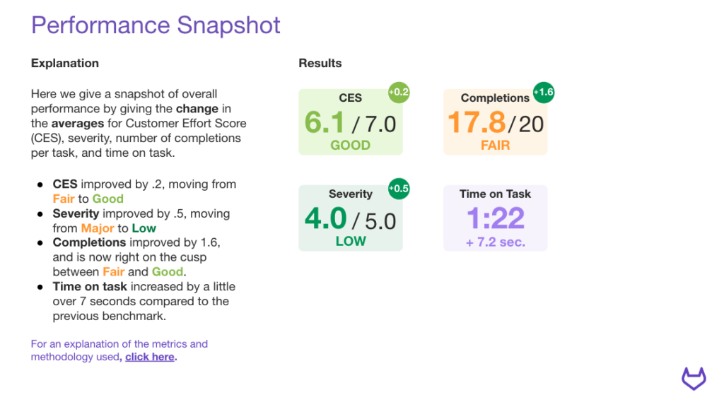
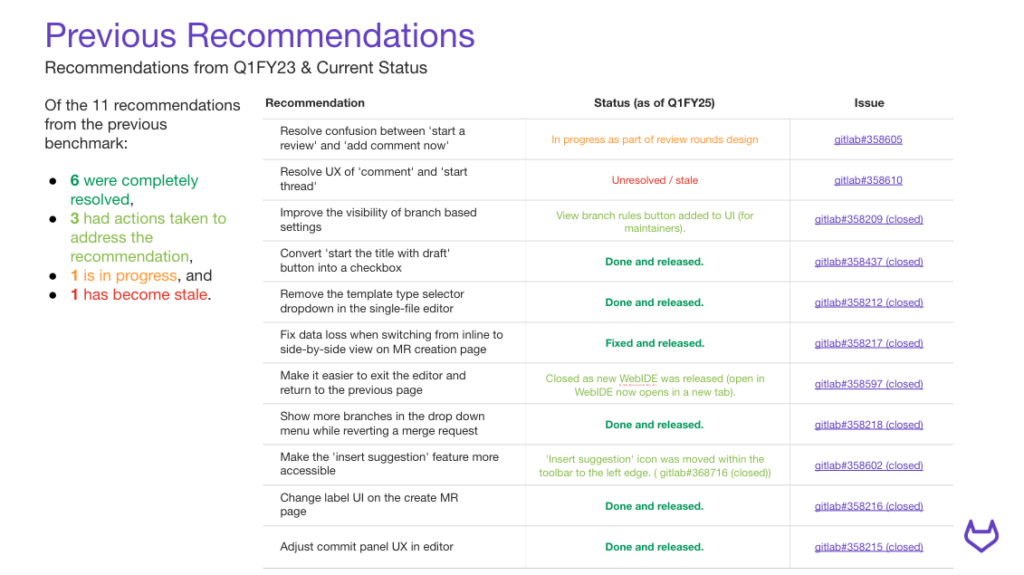
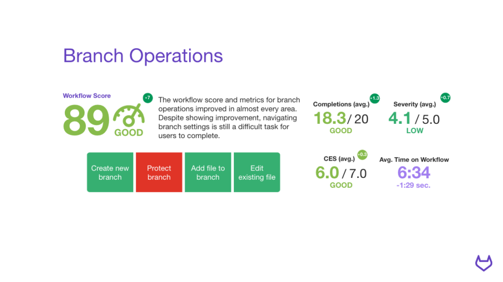
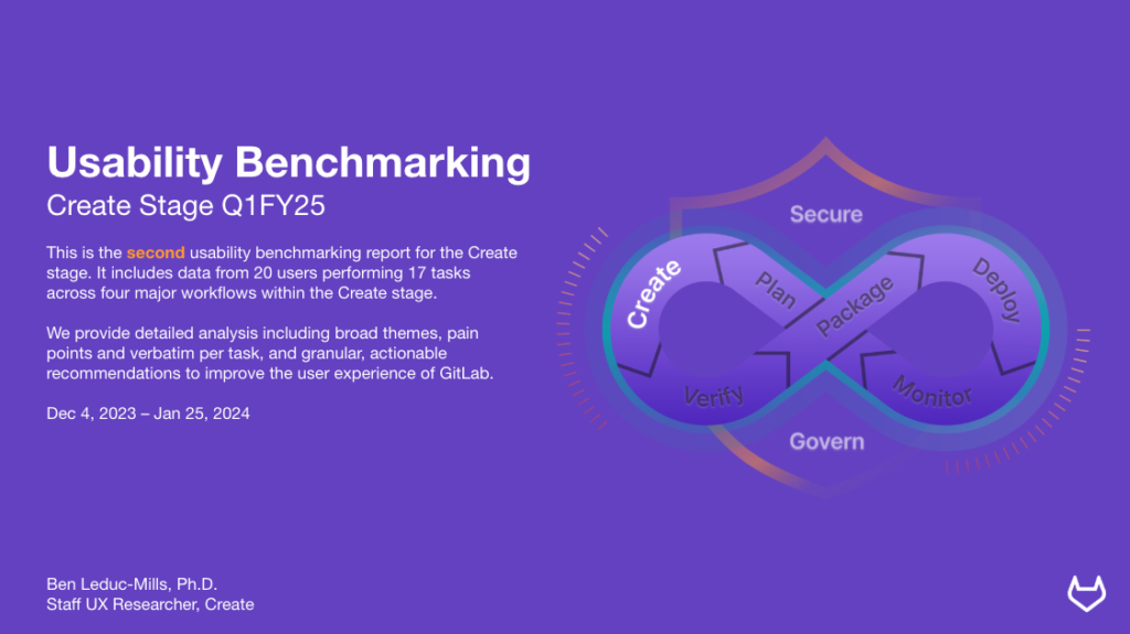
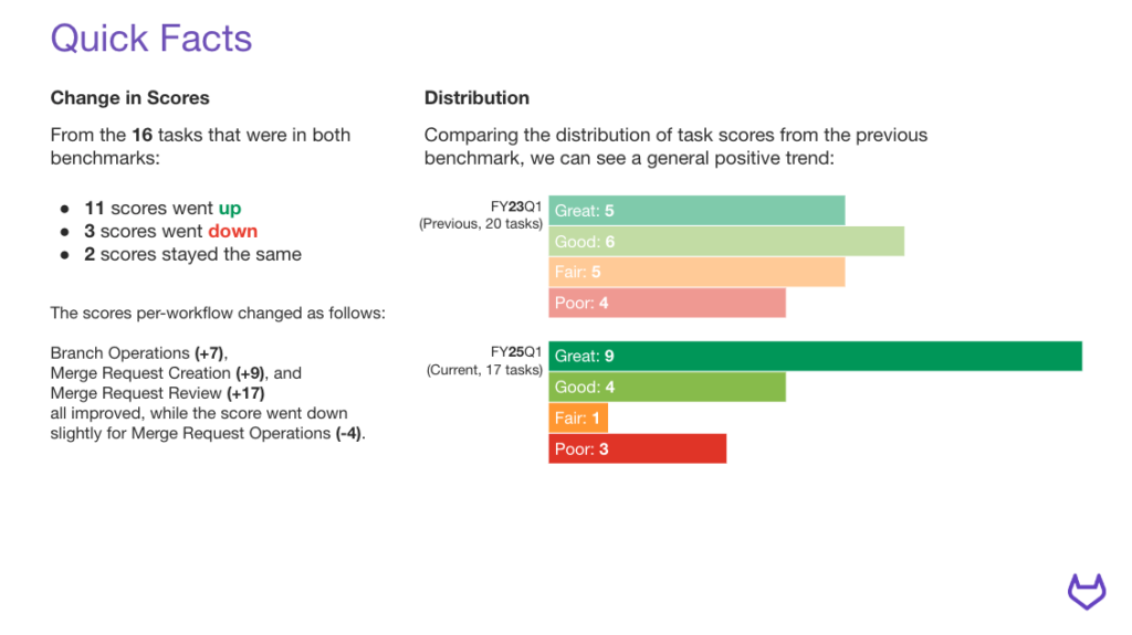
Eighteen months and a round of fixes later, the second benchmark came back at 87 out of 100, a 7.1 point jump that moved the overall rating from fair to good. Branch Operations climbed to Good, Merge Request Creation to Great, Merge Request Review to Good, while Merge Request Operations actually dipped slightly. Of the 16 tasks that existed in both studies, 11 improved, 3 got worse, and 2 held steady. Of the 11 recommendations that came out of the first study, 6 were fully resolved and released, 3 had concrete action taken, 1 was in progress, and 1 had gone stale.
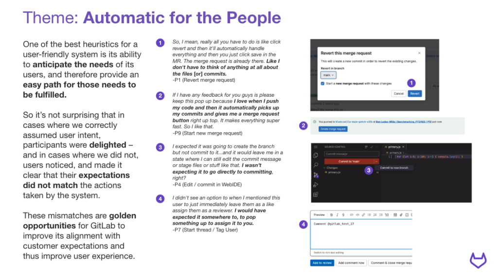
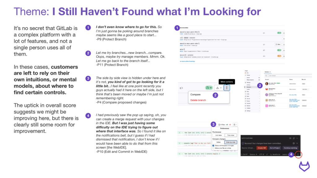
The themes shifted too, which was its own kind of signal. “I Still Haven’t Found What I’m Looking For” picked up where the old wayfinding problems hadn’t fully gone away (“Let me try branches…new branch…compare. Oops, maybe I manage members. Mmm. Ok. Let me go back to the branch itself…”), but a new theme, “Automatic for the People,” showed up alongside it: in the cases where GitLab correctly anticipated what someone needed next, participants were genuinely delighted by it. One participant, mid-task, stopped to volunteer feedback unprompted: “If I have any feedback for you guys is please keep this popup because I love when I push my code and then it automatically picks up my commits and gives me a merge request button right up top. It makes everything super fast. So I like that.” That’s the kind of finding a system-level SUS score would never surface: not just that something was broken, but exactly which piece of invisible, automatic help was working, so we’d know not to touch it.
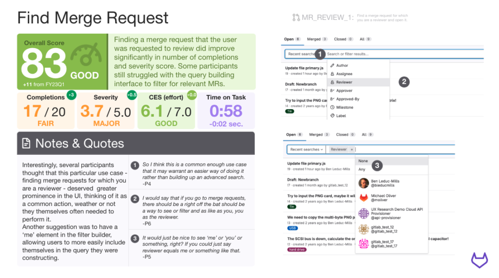
The task-level detail mattered too. On “Find Merge Request,” several participants independently asked for the same missing thing: a way to filter or default the view to merge requests where they were the reviewer. “It would just be nice to see ‘me’ or ‘you’ or something, right? If you could just say reviewer equals me or something like that.” That’s a specific, buildable recommendation that a whole-product score could never have produced, and it’s exactly the kind of insight the program was built to surface.