A simple flowchart as an exercise in understanding
Early in my time as a UX Researcher at Autodesk, there were only two of us on the team (there are 10 at the moment I’m writing this), and we needed ways to engage folks in research and help our stakeholders understand it better. I was teaching myself Figma at the time, so I deciding that creating a (admittedly incomplete and oversimplified) flowchart might be a good way to ‘get the word out’ that our research practice was expanding and we could help guide your research efforts — even if we didn’t always have the bandwidth to lead the research ourselves.
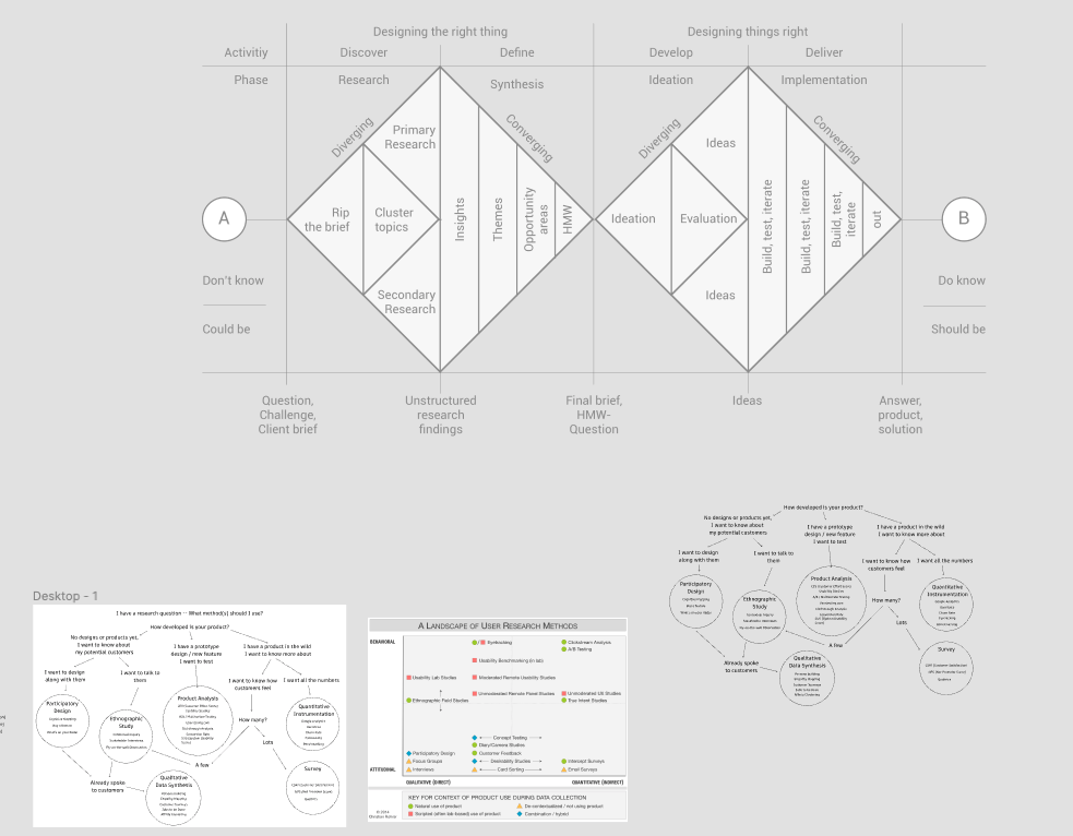
I started with some research — of course. How had others visualized this? What frameworks or methodologies could I leverage to organize the information? Most of you will of course notice the double diamond below. Which techniques and research methods should I include? I created a messy mood board in Figma to help organize my thoughts, and began connecting pieces together.
After some iteration and critique, I had my final version, shared below. In the internal version at Autodesk, each of the methods are hot-linked to example and explanation of that particular method.
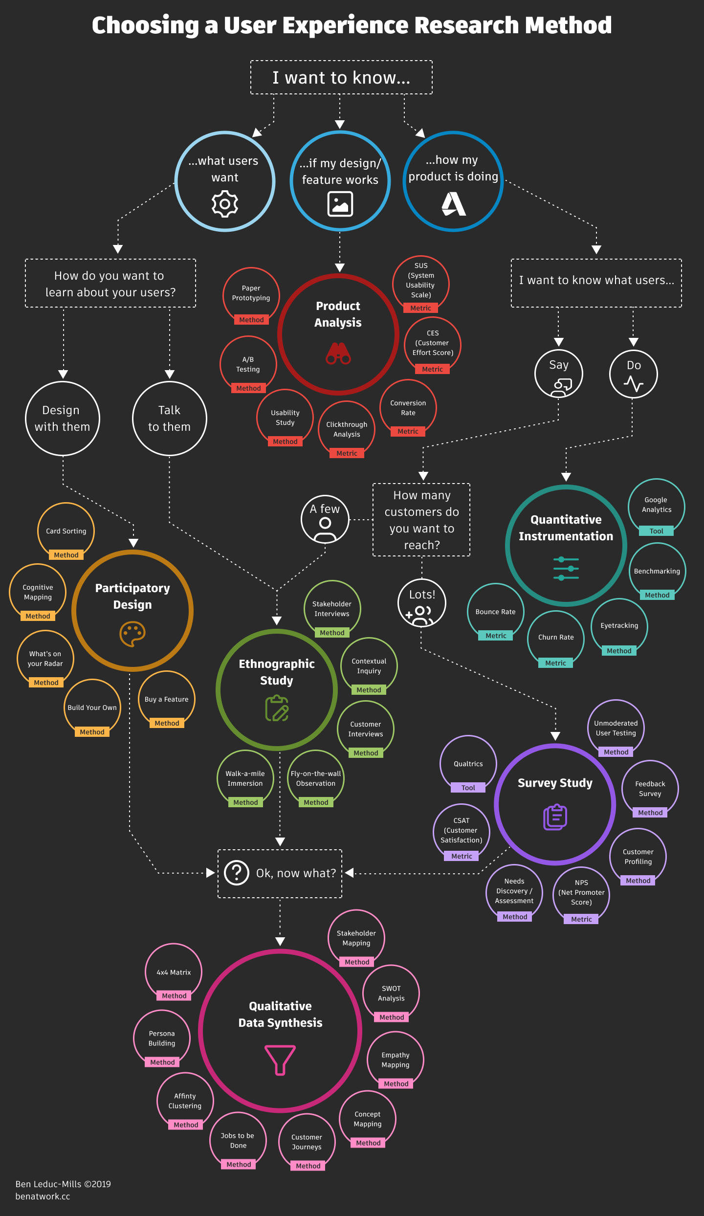
If you’d like a copy or to use it in your organization, here’s a PDF link – my only ask is that you leave me a comment below to let me know a bit about your use case – I’m a researcher, after all!

Hello, would love if you could share a pdf version of this. I love your work. Many thanks
Amazing work!
Hi! I’m a new user researcher and would love a pdf of your flowchart please!!
Thanks so much.
Hi all! Apologies for the delay – I left a link in the post above to a PDF version of the map – enjoy!
Hi! I’ve been looking for a UX research methods flow chart that spans from discovery research to design/product testing. Just absolutely love your graphic. It is the closest one that I’ve found that aligns with my experience and practice. I was just wondering if there was a reason that “Talk to them” and “Say” don’t both flow directly into “How many customers do you want to reach” and then the “yes” and “no” branch off.
Hey Ben, thanks for the refreshing outlook on UX research method. I’m in the midst of a research timeframe for a finance product and I find your roadmap insightful